What Is & What Should Never Be: Denver Broncos Logos
There are certain topics I usually do not write about: politics and sports. Now it’s not that I don’t have opinions on these subjects, quite the contrary. In fact if you would like to hear these opinions, come to Denver, buy me a beer and I will tell you all about them in excruciating detail.
It’s just that I find these things to be divisive and incendiary and prone to ranty type posts that border on the boring. Not to mention there are a multitude of other places to go if you want to read more informed people get angry, like for instance, everywhere else on the Internet. But with the Super Bowl coming up and living in Denver I feel the need to get all sporty and civic-pridey.
I am not going to write the typical sports post by breaking down the ins and outs of how the Denver Broncos will defeat the Seattle Seahawks Carolina Panthers on Sunday. Rather I am instead going to chronicle the history of the Bronco logo. Because that’s just fun.
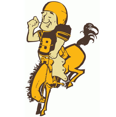
1960-1961
Wow. What can you say about this? The brown-yellow color combination stands out, not in a good way mind you, but it does stand out. And really what says “football” more than a guy in shoulder pads and chaps riding a tiny horse? And I assume he’s picking his teeth, either that or he’s pulling random facial hair off his cheek. Thankfully this only lasted a season.
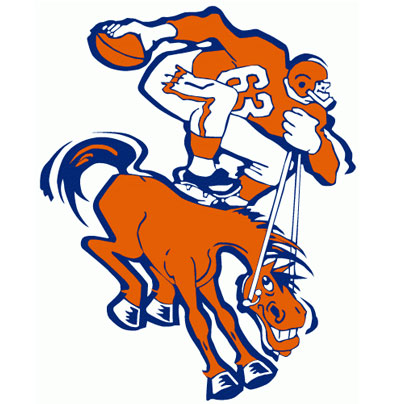
1962-1969
Well the color combination is right. What’s that? No it does not look like a Howard Johnson’s, hush. Question: should a man be riding a horse with cleats on his back like that? Looks painful. And does he have a tiny little head or just giant hands? The look on the horses face is classic. Oh he’s up to something for sure.

1970-1996
The classic we all know and love. Except as a kid I never really knew what the horse was blowing out his nose. It’s like a bullet is being expelled from his muzzle. Still, classic.

1997-PRESENT
And here we have the current incarnation. Very modern. Sleek and streamlined, almost metallic looking. It’s Robo-horse with an orange mane like flames and deamon eyes.
Be afraid.
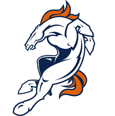
1997-PRESENT (Alternate)
And here we have the alternate logo for the current era. It’s very cool, don’t get me wrong, but it does feel to me as if the horse is doing some kind of tap dance number. I expect to see jazz hooves at any moment.
Hope you enjoyed this trip down memory lane. Enjoy the game on Sunday.
Go Broncos.
Originally posted on January 30, 2014





Andy Garcia says:
Joe says:
Paul Matthew Carr says: